The client
K&H Bank, owned by Belgian KBC Group, is a prominent figure in the Hungarian financial scene. The holding group is one of the worlds biggest financial conglomerates with more than 36 thousand employees on a global scale. This institution has an experience of over three decades serving corporate financial needs and they also offer highly efficient and stable financial services for the general public as well.
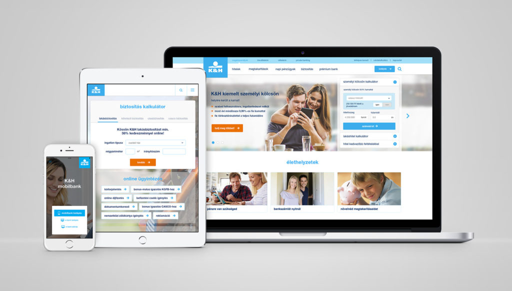
The Hungarian branch of K&H Bank decided in 2015 to start prioritising electronic channels when it comes to brand communication and sales and they also decided to renew their digital platforms. The bank launched a tiered, professional tender that we applied to in collaboration with Webtown. As the finalists, our team was appointed to work on the user experience and the design planning, while Webtown was in charge of the development process itself. The task was a challenging one: the project scope included not only the renewal of kh.hu, but the development of their e-bank system as well as the updating of their mobile application. Most of the planning process took place in the second half of 2015, and the new site was launched in April 2016.
Methodology
Redesigning all online platforms, communication channels and customer service tools of a bank involves many participants. Several task forces with high capacities have been established on our end as well as the client’s end so that all effected channels can defy their business requirements. It was of the essence to manage a planning and development project of such scale with the right amount of coordination, otherwise the involvement of all the stakeholders could have ended rather poorly. The solution was to apply an extensive Scrum methodology for the whole project. The execution of the project was based on an agile methodology that was further supported by a unique project management solution. The project was broken down to sprints so that each phase could support both the development process and the business needs of the site at the same time.
Preparations and analysis
All UX planning projects should start with a careful assessment of business requirements. As part of the first stage we carried out in-depth interviews, analysed competitors and we used benchmarking tools to create the toolset of the site and its navigational mechanisms. Given that K&H Bank wanted us to renew a complex digital ecosystem, we’ve invested time and energy to fully understand their business needs first.
While developing the site, we’ve adapted several well-known ecommerce solutions. We’ve also featured new solutions both from a navigational and a conversional perspective, while offering transparent and self-explanatory sales processes. While planning the site we’ve examined different catalogue building approaches and conversional logics both in Magento and in other complex ecommerce engines as well.
Ergonomic challenges
In close collaboration with the bank’s business analysis team we’ve measured and handled different, segment-based requirements and expectations. Workshops and interviews laid the foundations for this and they also provided the key aspects of most of the planning sprints. To map out the logic considerations of the site, we’ve used wireframes as a tool. This solution is the essential starting point for all our projects. The ergonomic framework of the site has been defined as a result of careful evaluation and finetuning of the wireframes.

In the final stage of the wireframe planning, we carried out personal interviews with selected and predefined test user personas using HTML prototypes, that were specifically created for this process. With the help of the testing prototypes we could examine user behaviour – that’s otherwise only measurable on live sites – and we could ensure that user needs are met from the very early stages of the development. With these, we could also identify a few dead ends on the site and we had a chance to change these to create more optimal engagement continuity so that the journey on the live site could be renewed in a more effective way.
One of the special features of kh.hu is its unique calculator solution that’s linked to several products – with it’s help users can customise their loans or their financial packages before reaching out to the bank directly. It was a challenge for us to create a smaller scale and an extended version of this calculator simultaneously, to create a base version that can be used in many ways and to test all these in a thorough manner. We had to deliver a solution that felt unified and consistent but could also be product-specific and easily manageable. It was of high priority during the planning process, that a simple calculation that started on a base level could be detailed further in a straightforward way by means of using the calculator functions at any point of the sales funnel. All this had to be executed in a way that part-conversion is kept as high as possible.
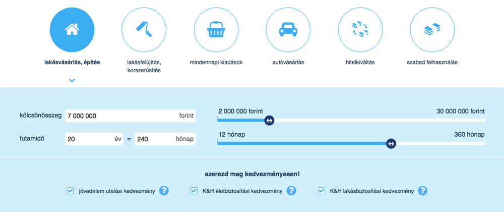
The UI designing of product-specific calculators
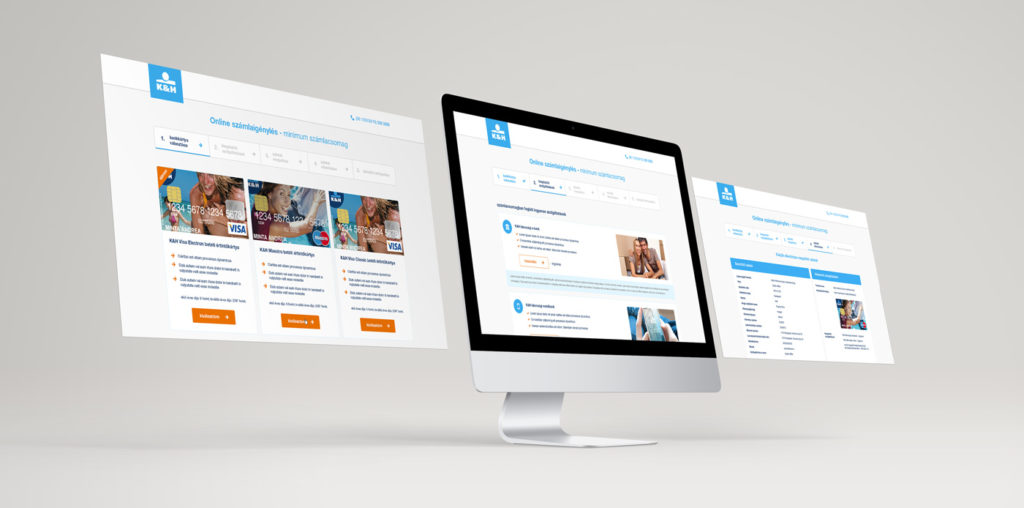
When designing the more complex pages of the site we opted for a sales funnel method. We’ve used longer drop-down structures, bigger spacings, more prominent headline typography and key visuals for the interfaces’ ergonomics. The whole project was informed by sales support, meaning that all financial products (loans, savings, insurances) required their own, uniquely developed funnel pages. This set the challenge for the UX design, as all these different landing pages and processes had to come together as part of a consistent and unified user experience. On the new site of K&H Bank, users can find a lot of different layouts, but these all fit in a coherent ergonomic and visual framework: the different pages will have different structures and content, but they will all feel familiar and easy to use for the customer.
UI design planning
Planning the design started with laying down the foundations of the web identity. When launching the project, the bank didn’t have any design guidelines that could have been adapted for web use. As the first steps, we came up with look&feel plans that reflected the offline identity of K&H Bank through implementing different webdesing styles. This is a very sensitive process for all project as the identity, that’s being heavily used for all existing communicational channels, needs changing to a certain extent. As the project did not involve or allow for changing the corporate identity itself, we had to experiment in a careful way to figure out how to link up existing corporate branding elements with UI components. During the process we had to make smaller branding tweaks that are only visible on the site, but not on any other branding platforms or channels. Towards the end of the whole process we managed to create a visual framework that still stays through to the core brand identity but is also suitable for online use.

When evaluating the look&feel plans together with the client, we’ve opted for a design that is built on material stylistics: this option is flexible in it’s simplicity, can be developed further with ease, it’s timeless and accommodates for presenting the rich visual content of the bank that is often seen in many of their advertisements and on their branded products. We’ve set the ration of text and visual content in this phase as well as arrangement guideline, illustrations and the stylistics of different components.
After creating the base for the online identity, we started working on the webdesign in smaller ‘packages’, otherwise known as sprints. After mapping out each business need, we created wireframes and design toolkits. Alongside this process, we also started planning for the focus areas of the next sprint. The whole design has been created as a result of a series of planning sprints. The client actively participating in the process by means of attending our design workshops.
While planning the layout we had find ways to unify and integrate the other products of an omni-channel supporting, complex digital portfolio (such as K&H e-bank and a mobile app) with the site.

As part of the graphic design, we’ve broken down the frameworks and micro interactions to chapters and we’ve arranged them into a sitebuild-based UI kit that also serves as a style guide for the site and for the other digital products of the brand. A corporate site constantly changes and develops. To ensure that the visual identity of K&H Bank remains consistent in the coming years as well, we’ve defined the site components and the project-specific webdesign guidelines in a way that they include all important reoccurring elements (buttons, forms, banners, calculators, boxes, etc.), colour harmonies and online typography rule sets as well.
In case of a banking site, it’s also important that they can react and respond to quickly emerging new demands (such as new communicational channels or special landing pages). To UI kit is also a great tool to support with this as it incorporates a component package that’s easy to use for new page types or frontend modules.

Development and launch
As part of an agile process planning and development went hand in hand. The development was carried out by Webtown using one of the world’s leading Java site systems, Liferay Enterprise as a base. Our team supported this process with preparing the frontend micro interactions in advance and we’ve also actively participated in the testing phase. During the enriching and launch periods, we’ve supported the client by providing content creatives.
The finished corporate site, that lived up to all expectations both on a business and on a communication side, launched in spring 2016. We are proud to say that the site we’ve created for K&H Bank became a benchmark for local financial institutions. The communication and sales experts of the bank manage the new site in a professional manner, utilising the opportunities provided by the Liferay technology. It has been a great honour for us to work on other projects with this client after the launch of this site as well. Click here to check out the website of K&H Bank.
