Introduction
The Museum of Fine Arts, Budapest opened 113 years ago in December 1906 and already at the time it was named one of the most prominent museums in Europe. With nearly 120 000 pieces of artefacts, the museum is the owner of Hungary’s most important collection, that showcases both local and international pieces dating from the ancient times to the end of the 18th century. After 3 years of extensive reconstruction the museum reopened on 31 October 2018, and for the first time since 1945 the previously closed Roman Hall became accessible to visitors again.
Alongside the reopening celebrations, the museum’s new website – based on the system developed by Oander – made its debut as well. Soon afterward the Hungarian National Gallery transitioned to the same platform too. The launch was preceded by months of planning, development and content creation – it was one of the most exciting projects in recent years, during which we had a chance to work with a great professional team on the client’s side who allowed us to be creative and who had trust in our work.

Challenges
The aim of this project was no less than to create a museum website that reflects the best of knowledge, that incorporates the patterns of successful best practices and that is equipped with its own, unique features. A requirement of the development was that the site had to be not only visually exciting, inspirational and informative but it also had to feature ticket purchasing options with displays throughout prominent touchpoints, transforming the site to an online ticketing platform. This provided us with an opportunity to create an identity that will set the bar for future museum and cultural developments on an industry-level.

Site technology
The client was looking for an open source code technology for the development, but they also wanted the system to have a build that can manage a complex website network. At the beginning, they didn’t have a clear idea of what potential functional developments they might need in the future, so they were after a system that can be updated quickly and in a flexible way. We also had to take into consideration that the existing site had a lot of live content, meaning that the admins needed a site engine with which they can edit and update a whole range of different content on to the site. Another challenge was that the service and content offering of museums and such institutions change all the time, meaning that it was impossible to forecast what communicational requirements might came along the way in the next years, that the site needs to accommodate for. In order to accommodate for this, we had to create a lot of components that could be used universally and flexibly. The project needed also needed a user-friendly, ergonomic content admin system. Based on the above, Oander’s team suggested WordPress CMS as the base for the development, enriched with numerous module developments and a unique frontend appearance.
Workshops and ergonomic planning
While preparing for the project, a best practice research was carried out, the previous pages of the institution’s website were heatmapped and a UX analysis was made, based on traffic. This defined the client’s demands and together we managed to set the scope of the project. One of the objectives was that other museums should be able to use the website under the same installation as well, so we consulted with clients from partner institutions, communication experts, collection managers and marketing specialists during the project.
 Wireframe examples of the website
The planning process was centred around the UX design methodology of Oander, meaning that the whole concept and ergonomic planning was done in close collaboration with our clients during workshop sessions. The ergonomic planning covered everything from different page types to layouts, during which we used wireframes to create the best user journey and information architecture. An important aspect of the development was the perfect responsiveness of the design: this is achieved by a number of different layout sizes including a variety of desktop widths, including ultra-wide. This meant planning for nearly 200 sites and wireframe variants that we discussed during the workshops, and we finetuned these together with the client’s team of experts.
Identity and UI design
The wireframe planning stage was followed by designing, with a deliberate overlap between the two so that UI design considerations and ideas could influence the ergonomics. The foundations for the design were laid by the museum’s new brand identity, but apart from the logo, the base colours and the typography we were free to experiment. The objective was to create a user experience that is driven by content and typography for which clarity and wide spaces are key. The new site ended up having a minimal design and a flat layout: a clean user interface that’s not intrusive and that let’s content and visuals take the spotlight.

Of course, all UI design plans were created with responsiveness in mind, including additional identity elements such as the illustrational icon package, the crop guide and so forth. We created a separate user’s manual that outlines guidance for appropriate and visually-pleasing content creation, helping the work of the administrators.
Development
The site consists of nearly 40 different types of pages. The static frontend designs were created before the WordPress backend and template development. Based on the scope of the project, this was a big task. The frontend was built on a pre-prepared UI kit, meaning that buttons, components, colour schemes or identity elements can be quickly changed during future developments.
As for the backend we created lots of unique modules to add on to WordPress. The system integration of the site was a great challenge: it was crucial for the collection database appearing on the website to be in sync with the museum’s backend system. Ultimately, we had to create a complex, integrated collection browser.
The development was based on agile methodology and it was carried out in tiered release cycles, meaning that the client was testing the product along the way. After finalising the plans, we organised additional workshops to train the client on content management.

Special functions and interesting features
- The most important units of the site are the ones showcasing exhibitions. Instead of using fragmented layouts as before, these units were transferred onto longpage layouts. We created exciting editorial content with rich visual references that showcase the key sight of exhibitions, containing useful information and some insights.
- Another important feature of the new site is the catalogue browser that is integrated with the museums backend system and its artefact record databases, showcasing the entire collection online.
- You can discover the whole collection (including the internal collections of workshops), you can get to know the members of the staff, the work that’s done behind closed doors and you can explore related publications as well.
- Editorial content is still key on the new website, from news to important information for visitors – all having special site structures, involving other channels that focus on artefacts, important events and exhibitions.
- The museum offers a virtual tour to visitors and it provides thematic suggestions and path options online for visiting certain rooms or exhibitions of the museum.
- Programmes and linked events are also offered by the museum, these can be checked online and visitors can register straight away as well.
- To support browsing through the extensive content, we’ve opted for an intelligent, predictive hosted search solution. We’ve used Algolia, that’s the absolute leader within its own field when it comes to speed and performance. With Algolia databases can be made searchable, indexable and filterable.
The Museum Shop
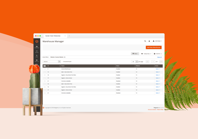
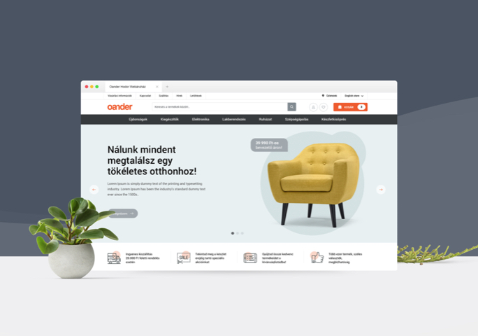
Besides the WordPress site of the Museum of Fine Arts, we’ve also developed a Magento 2-based webshop that has since became an integrated part of the online ecosystem of museums. The Museum’s webshop offers its own merchandise, gifts, books and publications that are linked to their current exhibitions or collections, as well as products of other Budapest-based museums and galleries so strong integration was needed between the webshop and the websites involved. Two-way promotions, product offers and mutual discount systems are all enhancing the efficiency of the integration further. Our team offers constant support for the webshop administrators to maintain the strength of these synergies.

Results
Our work didn’t stop after the go live: we started heatmapping the site’s interface and used UX analysis to improve it even further. To our great pleasure, we were hired for another development project including technical support as well, based on an agile methodology in a Scrum setup, working in close collaboration with the client. After the Museum of Fine Arts, MNG (Magyar Nemzeti Galéria | Hungarian National Gallery) started using the new site technology as well. The teams of the museums are utilising their new sites with devotion and with great creativity.

’The Museum of Fine Arts will be one of the most important landmarks of Budapest, showing foreigners and Hungarians alike, that this land is home of great cultural enterprises and that important civilisational works are in the making here.’
Vasárnapi Újság (Sunday News), 53rd edition, issue 49 (9 December 1906)
